
Linear Regression using R
Hi Everyone! Today, we will learn about implementing linear regression using R and building the linear regression model in R using a dataset from kaggle. The dataset is divided into two parts, one is train.csv and the other one is test.csv. We will make our model using train.csv and then test it using test.csv. I am using R notebook in the blog post and the data set has two variables, x and y. x being independent variable and y being dependent variable.
Reading and summarizing the data
#Implementing linear regression in R
data <- read.csv("C:/Users/jyoti/Downloads/train.csv")
summary(data)
## x y
## Min. : 0.00 Min. : -3.84
## 1st Qu.: 25.00 1st Qu.: 24.93
## Median : 49.00 Median : 48.97
## Mean : 54.99 Mean : 49.94
## 3rd Qu.: 75.00 3rd Qu.: 74.93
## Max. :3530.16 Max. :108.87
## NA's :1R shows six-point summaries of the variables in the dataframe. min is the minimum value, 1st Qua is the 25%ile value, median is the 50%ile value, 3dr Qua is the 75%ile value, max is the maximum value and mean is the mean of all the observations of the corresponding variable. The summary also shows NA’s or number of missing observations of a particular variable. In x, there is no missing variable but in y, there is 1 missing variable.
Correlation analysis
Next step is to find the correlation between two variables, if any, between x and y. This can be done by using cor() function in R. If you try to find the correlation of two variables having missing values using the cor() function, you will get following as the output:
cor(data)## x y
## x 1 NA
## y NA 1Missing value imputation
Because y has 1 missing value, the cor function is giving na as the output. To resolve this, we need to do mean imputation and then find if theere still are any missing values or not using summary function again.
data$y[is.na(data$y)] = 49.94
summary(data)
## x y
## Min. : 0.00 Min. : -3.84
## 1st Qu.: 25.00 1st Qu.: 24.99
## Median : 49.00 Median : 49.10
## Mean : 54.99 Mean : 49.94
## 3rd Qu.: 75.00 3rd Qu.: 74.88
## Max. :3530.16 Max. :108.87Thus, there are no missing values now. Let’s apply cor function now.
cor(data)## x y
## x 1.0000000 0.2138303
## y 0.2138303 1.0000000The output shows that x and y are only 21.38% correlated.
Distribution analysis
Let’s do some visual analysis now.Let’s use par function and generate two plots of x and y and show then in 1 row and two columns.
par(mfrow = c(1,2))
hist(data$x, main = "distribution of x")
hist(data$y, main = "distribution of y")
Thus, the plot of y is approx normally distributed, but not of x.
Outlier handling
Let’s generate boxplot of x and y now.
box1 = boxplot(data$x)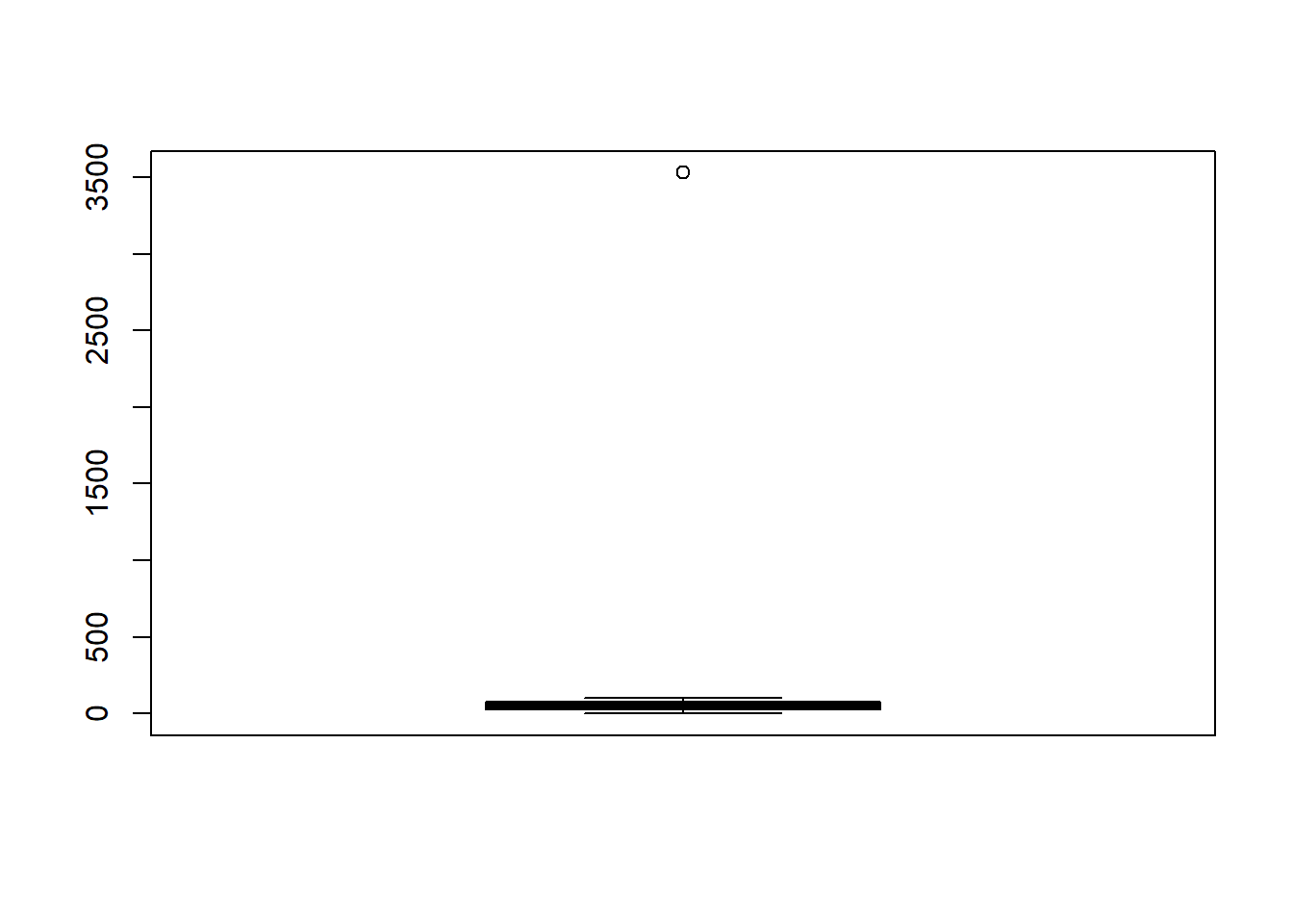
This shows that there are outliers in the x variable. Also, let’s generate the boxplot of y.
box2 = boxplot(data$y)
Thus, y doesn’t have enough outliers. Now, we will need to handle the outliers because presence of outliers may not give us the desired result! Let’s generate quantile analysis of x.
quantile(data$x, seq(0, 1, 0.02))## 0% 2% 4% 6% 8% 10% 12% 14%
## 0.000 2.000 4.960 7.000 8.000 10.000 13.000 15.860
## 16% 18% 20% 22% 24% 26% 28% 30%
## 17.000 19.000 21.000 23.780 25.000 26.000 27.000 29.700
## 32% 34% 36% 38% 40% 42% 44% 46%
## 31.680 34.000 36.000 38.000 41.000 42.000 44.560 47.000
## 48% 50% 52% 54% 56% 58% 60% 62%
## 48.000 49.000 51.000 52.000 54.000 55.420 58.000 59.000
## 64% 66% 68% 70% 72% 74% 76% 78%
## 61.000 64.340 67.000 70.000 71.000 74.000 75.240 78.000
## 80% 82% 84% 86% 88% 90% 92% 94%
## 81.000 84.000 86.000 88.000 89.120 91.000 93.000 95.000
## 96% 98% 100%
## 98.000 99.000 3530.157We can see that the 100% value is the main outlier in case of x. Let’s handle this by generating a new dataframe.
finalData = data
finalData$x = ifelse(data$x > 99, 99, data$x)
Now, let’s do the same for y.
quantile(data$y, seq(0, 1, 0.02))## 0% 2% 4% 6% 8% 10%
## -3.839981 1.400143 4.027188 6.814947 8.445068 10.264419
## 12% 14% 16% 18% 20% 22%
## 12.109471 14.094909 17.317910 19.404504 21.197887 22.537589
## 24% 26% 28% 30% 32% 34%
## 24.511020 25.690335 27.199616 29.151251 31.762465 33.670006
## 36% 38% 40% 42% 44% 46%
## 36.302391 37.980422 41.095325 43.222012 45.054610 46.912769
## 48% 50% 52% 54% 56% 58%
## 48.000888 49.095828 50.120910 52.376437 53.592696 55.658733
## 60% 62% 64% 66% 68% 70%
## 57.273872 59.193245 61.418188 63.559271 66.347003 69.898164
## 72% 74% 76% 78% 80% 82%
## 71.700767 73.746075 75.523592 78.242993 80.933215 83.555818
## 84% 86% 88% 90% 92% 94%
## 86.107227 86.987577 88.885099 91.170832 92.890793 94.641859
## 96% 98% 100%
## 96.196669 99.406205 108.871618We can see that there is no enough presence of outliers.
Correlation analysis of cleaned data
Now, let’s find the correlation between x and y of finalData.
cor(finalData)## x y
## x 1.0000000 0.9932878
## y 0.9932878 1.0000000As you can see, after missing value imputation and handling of outliers, we get 99.328% positive correlation between x and y.
Bivariate analysis
Let’s verify this by generating a scatter plot with x as independent variable and y as dependent variable.
plot(finalData$x, finalData$y, main = "Scatter plot of x and y")
Thus, x and y are positively correlated or as x increases, y also increases.
Modeling linear regression using R
Let’s now make a model.
model = lm(y~x, data = finalData)
summary(model)
##
## Call:
## lm(formula = y ~ x, data = finalData)
##
## Residuals:
## Min 1Q Median 3Q Max
## -48.797 -1.960 0.101 1.922 10.135
##
## Coefficients:
## Estimate Std. Error t value Pr(>|t|)
## (Intercept) 0.003116 0.254250 0.012 0.99
## x 0.997310 0.004396 226.875 <2e-16 ***
## ---
## Signif. codes: 0 '***' 0.001 '**' 0.01 '*' 0.05 '.' 0.1 ' ' 1
##
## Residual standard error: 3.367 on 698 degrees of freedom
## Multiple R-squared: 0.9866, Adjusted R-squared: 0.9866
## F-statistic: 5.147e+04 on 1 and 698 DF, p-value: < 2.2e-16The equation we get is y = 0.997310*x + 0.003116. 98.66% of R-squared implies that 98.66% variation in y is explained by x. Intercept of 0.003116 says that there is only this much about which can’t be explained and this gives our model as highly reliable.
Assumptions of linear regression
Let’s now see if the residuals satisfy the assumption of linear regression.
library(car)## Loading required package: carDatadurbinWatsonTest(model)## lag Autocorrelation D-W Statistic p-value
## 1 -0.0105545 2.019993 0.716
## Alternative hypothesis: rho != 0As you can see, D-W statistic value is 2.019993 which states that there is no autocorrelation among the residuals. D-W value lies between 0 to 4. Value of 2 states no autocorrelation, less than 2 states positive autocorrelation and more than 2 states negative autocorrelation. Let’s now see if the residuals are normally distributed or not.
hist(residuals(model))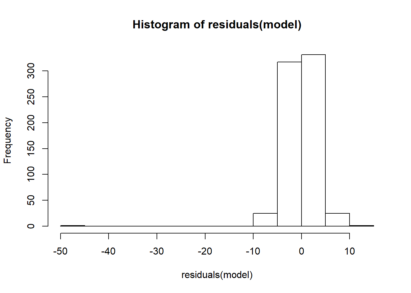
The residuals, approximately, have normally distributed. Now see if the distribution between y and residuals is uniformly or not.
plot(finalData$y, residuals(model))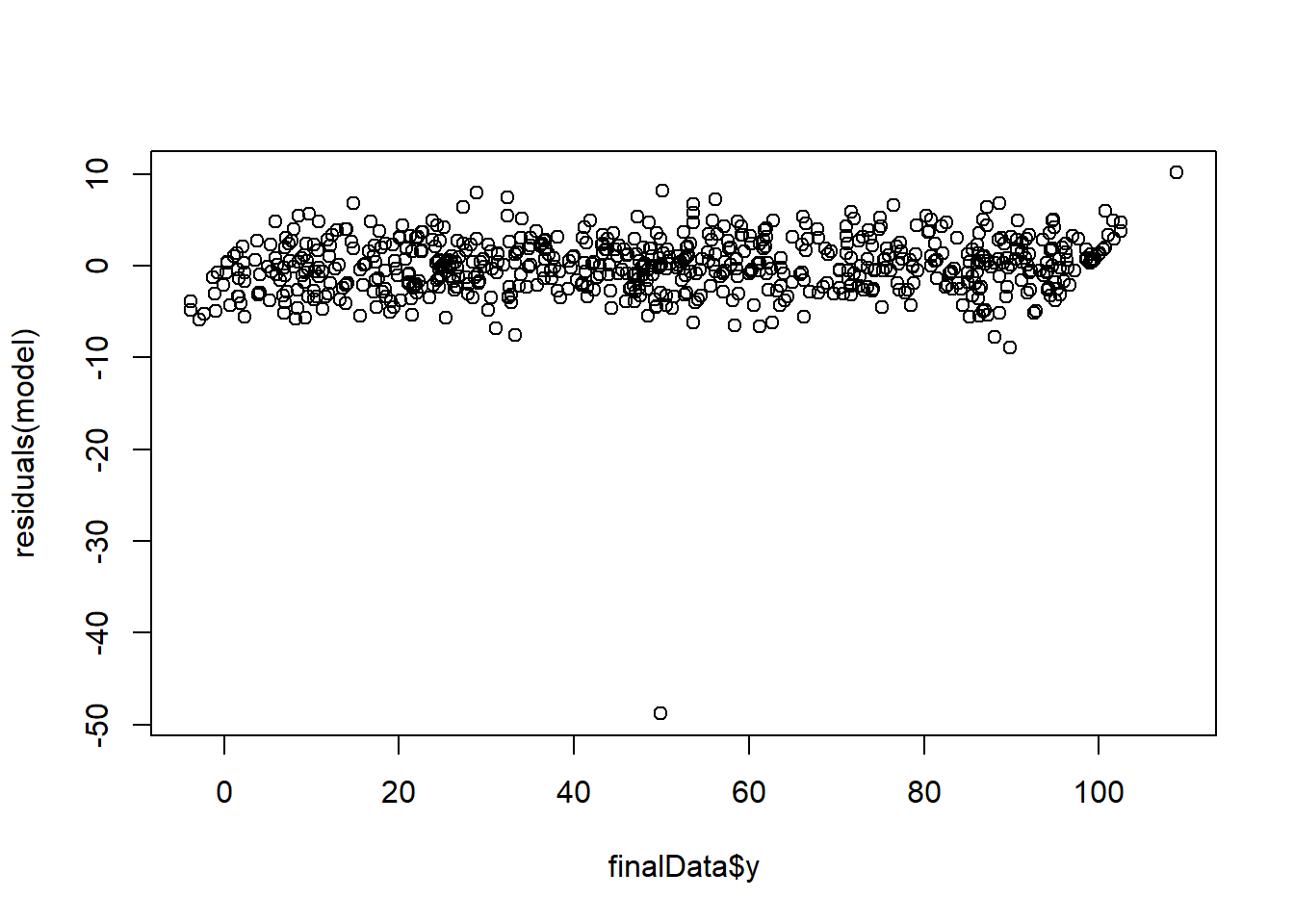
The distribution is uniform in nature. Thus, model satisfies all the assumptions of linear regression.
Predictions!
Let’s now use this model to predict the values in the test.csv.
newData = read.csv("C:/Users/jyoti/Downloads/test.csv")
newData$predicted = predict(model, newData)
summary(newData)
## x y predicted
## Min. : 0.00 Min. : -3.468 Min. : 0.00312
## 1st Qu.: 27.00 1st Qu.: 25.677 1st Qu.:26.93050
## Median : 53.00 Median : 52.171 Median :52.86056
## Mean : 50.94 Mean : 51.205 Mean :50.80278
## 3rd Qu.: 73.00 3rd Qu.: 74.303 3rd Qu.:72.80677
## Max. :100.00 Max. :105.592 Max. :99.73415