Prediction of Quality of Wine
We always thought, that “How we can predict quality of Wine?”, in this project we are going to solve that question only. We will be using a Red-Wine data set being provided on Kaggle, can be found here. It contains 12 columns or features describing the chemical composition of Wine and its Quality score (0-10). By the end of this article we will be able to easily predict quality of Wine & same procedure could be applied further on more real life data-sets to predict quality of wine (no matter from where we got that wine).
Lets load the data and have a look at it!!
import numpy as np
import pandas as pd
from IPython.display import display

# plotting modules
import seaborn as sns
import matplotlib.pyplot as plt
import self_made_visual as vs

%matplotlib inline

from time import time

# set seed for reproducibility
np.random.seed(45)

try:
    data = pd.read_csv("winequality_red.csv")
    print("Red Wine Quality dataset has {} samples with {} features each.".format(*data.shape))
    display(data.head())
except:
    print("Dataset could not be loaded. Is the dataset missing?")
Above features can be described as follows:
- fixed acidity most acids involved with wine or fixed or nonvolatile (do not evaporate readily)
- volatile acidity the amount of acetic acid in wine, which at too high of levels can lead to an unpleasant, vinegar taste
- citric acid found in small quantities, citric acid can add ‘freshness’ and flavor to wines
- residual sugar the amount of sugar remaining after fermentation stops, it’s rare to find wines with less than 1 gram/liter and wines with greater than 45 grams/liter are considered sweet
- chlorides the amount of salt in the wine
- free sulfur dioxide the free form of SO2 exists in equilibrium between molecular SO2 (as a dissolved gas) and bisulfite ion; it prevents microbial growth and the oxidation of wine
- total sulfur dioxide amount of free and bound forms of S02; in low concentrations, SO2 is mostly undetectable in wine, but at free SO2 concentrations over 50 ppm, SO2 becomes evident in the nose and taste of wine
- density the density of water is close to that of water depending on the percent alcohol and sugar content
- pH describes how acidic or basic a wine is on a scale from 0 (very acidic) to 14 (very basic); most wines are between 3-4 on the pH scale
- sulphates a wine additive which can contribute to sulfur dioxide gas (S02) levels, wich acts as an antimicrobial and antioxidant
- alcohol the percent alcohol content of the wine
- quality output variable (based on sensory data, score between 0 and 10)
Assumption
We will be assuming that wines having value higher than 6 will be considered good and other wines are not good.
Data Cleaning
- Check for Missing Values in the dataset — missing values will hinder us from making proper predictions as they will hamper correct calculation of Mean, Variance, etc.
# Checking for missing values
# Calculating total number of missing values in dataset

missingValues = data.isnull().sum()

display("Total number of missing values in our dataset are:", missingValues)
From above result we can see that we don’t have any missing values.
- Statistical Distribution of data — now before moving forward for further analysis lets have a look at different statistical aspects of data.
# Displaying description of data-set

percent = [0.04, 0.25, 0.5, 0.75, 0.96]
display(data.describe(percentiles=percent))
From above table we can clearly see the distribution of data — mean, standard deviation (std), min-max values and percentiles — all this will be helpful once we proceed further into analysis.
- Handling Outliers — Here we won’t handle outliers because we are looking for accuracy to minute levels not just some approximation — best wine may have very different attributes from other wines so we can not remove or modify outlier values in this scenario. We can relate this case to the data related to a medicine in that scenario as well we need all our data for getting highly accurate data. Due to this we may see some skewness in data while finding out correlation in data.
- Correlation between data — one thing must be noted, that while doing correlation we must scale all the features otherwise we will get biased correlation graphs. So before moving on to Correlation we will first Scale our data
# From sklear we are importing 'preprocessing'
# Further MinMaxScaler() will be used for scaling data between [0,1]

from sklearn import preprocessing

# Setting all the column names in a variable 'features'
features = data.keys()

min_max_scaler = preprocessing.MinMaxScaler()
data_array_scaled = min_max_scaler.fit_transform(data)

# Creating an empty data frame
data_scaled = pd.DataFrame()

for x in range(0,12):
    dataset = pd.DataFrame({features[x]:data_array_scaled[:,x]})
    data_scaled = pd.concat([data_scaled, dataset], axis=1, join_axes=[dataset.index])

display(data_scaled.head())
Now, our data is scaled in (0,1) range, now we will find correlation among different features
Visualizing Correlation using correlation graphs.
# Produce a scatter matrix for each pair of newly-transformed features
pd.plotting.scatter_matrix(data, alpha = 0.3, figsize = (50,30), diagonal = 'kde');

From above graphs we can see relation between different elements and their distribution like whether they are normally distributed or skewed. One thing can be noted that relation between each feature and output is represented in the form of Bar-Graphs.
- Fixed Acidity has positive correlation with Citric Acid and Density which means if Quality of wine improves with increasing Fixed Acidity then same will be the effect of Citric Acid and Density; it has negative correlation with volatile acidity and pH (higher pH value corresponds to basic nature that is less acidic).
- volatile acidity has negative correlation with Fixed acidity and Citric Acid.
Similarly we can look at different raltions among different features, it is very useful to have an insight of correlation of features as it helps us in determining the effect of different elements in starting stages only.
Let’s have a closer look between each element and our output using Bar-Graphs
- For Fixed Acidity
# Creating a empty figure then creating bar-graph using Seaborn
fig = plt.figure(figsize = (15,8))
sns.barplot(x = 'quality', y = 'fixed acidity', data = data)
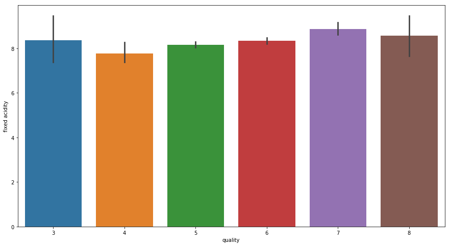
From above graph for Fixed Acidity vs Quality we can note that once acidity increases the Quality of wine improves but still it is still not able to clearly justify the result as we can see when Fixed Acidity was above 8 we have two values for Quality — (3, 7) thus it is not of much use independently.
- For Volatile Acidity
fig = plt.figure(figsize = (15,8))
sns.barplot(x = 'quality', y = 'volatile acidity', data = data)

From this distribution we can say that once Volatile Acidity decreases the Wine Quality Improves and same is justified by negative correlation between Fixed Acidity and Volatile Acidity.
- For Citric Acid
fig = plt.figure(figsize = (15,8))
sns.barplot(x = 'quality', y = 'citric acid', data = data)

It clearly shows that once the value of Citric Acid increases to a value of 0.4 we are getting best quality of Wine.
- For Residual Sugar
fig = plt.figure(figsize = (15,8))
sns.barplot(x = 'quality', y = 'residual sugar', data = data)

Residual Sugar is not able to clearly justify the Wine Quality.
- For Chlorides
fig = plt.figure(figsize = (15,8))
sns.barplot(x = 'quality', y = 'chlorides', data = data)
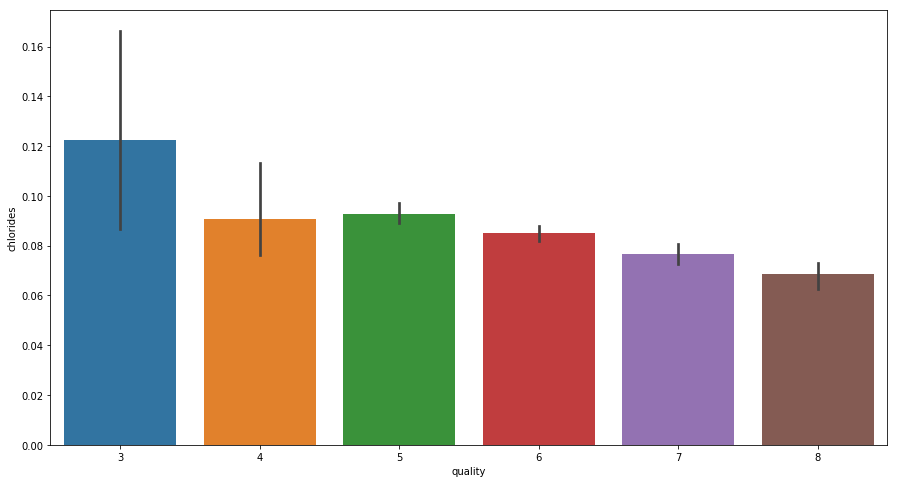
From above graph we can clearly see that Decrease in Chlorides corresponds to better Wine quality.
- For Free Sulfur Dioxide
fig = plt.figure(figsize = (15,8))
sns.barplot(x = 'quality', y = 'free sulfur dioxide', data = data)

Free Sulfur Dioxide alone is not able to clearly justify Wine quality.
- For Total Sulfur Dioxide
fig = plt.figure(figsize = (15,8))
sns.barplot(x = 'quality', y = 'total sulfur dioxide', data = data)

Similarly Total Sulfur Dioxide is also not able to justify quality of Wine
- For Density
fig = plt.figure(figsize = (15,8))
sns.barplot(x = 'quality', y = 'density', data = data)
Density of all wines are nearly same so it can not be used for discriminating quality of Wine
- For pH
fig = plt.figure(figsize = (15,8))
sns.barplot(x = 'quality', y = 'pH', data = data)
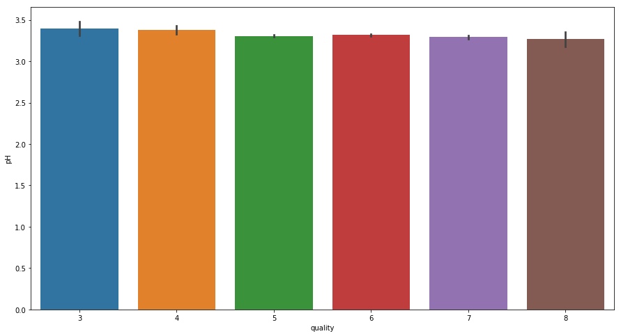
From above graph we can see once the pH decreases and reaches around 3.3 the Wine Quality reaches at its best.
- For Sulphates
fig = plt.figure(figsize = (15,8))
sns.barplot(x = 'quality', y = 'sulphates', data = data)
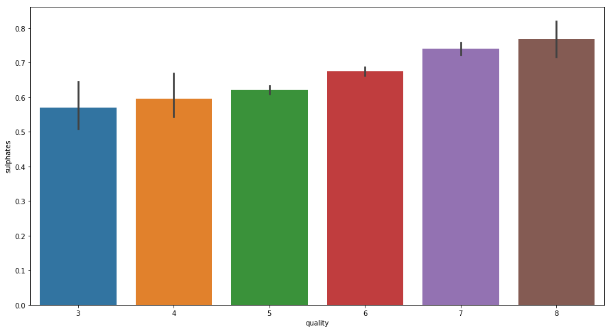
From above graph it is clear that once the value of Sulphates increase quality of wine also improves.
- For Alcohol
fig = plt.figure(figsize = (15,8))
sns.barplot(x = 'quality', y = 'alcohol', data = data)
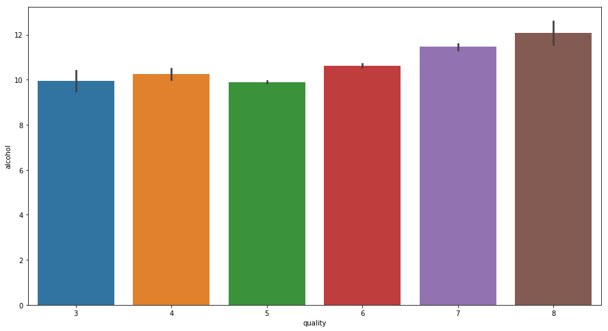
With increase in Alcohol quantity Quality of Wine Improves.
Interpretation
From above graphs we concluded that Density has not relation with quality of wine and features which alone are independently able to improve wine quality are — Citric Acid, Chlorides, pH, Sulphates and rest are dependent variables.
So, further analysis we will drop density feature from our data as it will only create overhead on our machine learning predictive model processing.
data.drop(['density'], axis = 1, inplace = True)
display(data.head())
Predictive Modeling
Now we will create a machine learning model which will help us to predict that which wine is best depending upon all the given features.
Preparing data-set for Machine learning
Dividing our data into good and bad wines or we can say into two buckets on the basis of which we will provide our final result.
# Dividing Quality into two labels -- Bad & Good

bucket = (2, 6.1, 8)
bucket_label = ['bad', 'good']
data['quality'] = pd.cut(data['quality'], bins = bucket, labels = bucket_label)
display(data.head())
By executing above code we have defined that all Quality values which lie between above range including (6.1 and 8) will correspond to ‘Good’ Wine and rest will be ‘Bad’, we can change this value depending upon our requirement.
Now, we will replace labels ‘bad’ and ‘good’ with 0 and 1 respectively.
data['quality'] = data['quality'].map({'bad':0,'good':1})
display(data.head(10))
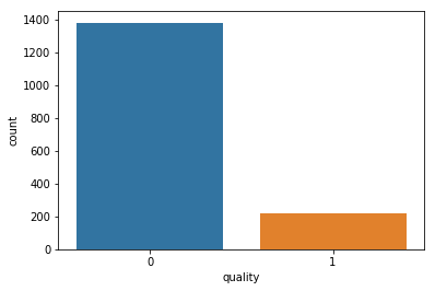
Counting total number of different Wine samples
# calculating count
display("Total number of different Wine samples: ",data['quality'].value_counts())

# representing counts using bar graph
sns.countplot(data['quality'])
Implementation – Creating a Training and Predicting Pipeline
To properly evaluate the performance of each model we have chosen, it’s important that we create a training and predicting pipeline that allows us to quickly and effectively train models using various sizes of training data and perform predictions on the testing data.
from sklearn.metrics import fbeta_score, accuracy_score

def train_predict(learner, sample_size, X_train, y_train, X_test, y_test):

    results = {}

    #Fit the learner to the training data using slicing with 'sample_size' using .fit(training_features[:], training_labels[:])
    start = time() # Get start time
    learner = learner.fit(X_train[:sample_size],y_train[:sample_size])
    end = time() # Get end time

    #Calculate the training time
    results['train_time'] = end - start

    # Get the predictions on the test set(X_test),
    # then get predictions on the first 300 training samples(X_train) using .predict()
    start = time() # Get start time
    predictions_test = learner.predict(X_test)
    predictions_train = learner.predict(X_train[:300])
    end = time() # Get end time

    # Calculate the total prediction time
    results['pred_time'] = end - start

    # Compute accuracy on the first 300 training samples which is y_train[:300]
    results['acc_train'] = accuracy_score(y_train[:300], predictions_train[:300])

    # Compute accuracy on test set using accuracy_score()
    results['acc_test'] = accuracy_score(y_test, predictions_test)

    # Compute F-score on the the first 300 training samples using fbeta_score()
    results['f_train'] = fbeta_score(y_train[:300], predictions_train, beta=0.5)

    # Compute F-score on the test set which is y_test
    results['f_test'] = fbeta_score(y_test, predictions_test, beta=0.5)

    # Success
    print("{} trained on {} samples.".format(learner.__class__.__name__, sample_size))

    # Return the results
    return results
Initial Model Evaluation
We will use Support Vector Machine (SVM) and AdaBoost for prediction, then based on this initial evaluation we will refine our chosen model.
# Import train_test_split
from sklearn.cross_validation import train_test_split

X = data.drop('quality', axis = 1)
y = data['quality']

# Split the 'features' and 'income' data into training and testing sets
X_train, X_test, y_train, y_test = train_test_split(X, y, test_size = 0.2, random_state = 0)

# Show the results of the split
print("Training set has {} samples.".format(X_train.shape[0]))
print("Testing set has {} samples.".format(X_test.shape[0]))

# Import two supervised learning models from sklearn
from sklearn.ensemble import AdaBoostClassifier
from sklearn.svm import SVC

# Initialize the two models
clf_A = AdaBoostClassifier(random_state=40)
clf_B = SVC(random_state=35)

# Calculate the number of samples for 1%, 10%, and 100% of the training data
samples_100 = X_train.shape[0]
samples_10 = X_train.shape[0]//10
samples_1 = X_train.shape[0]//100

# Collect results on the learners
results = {}
for clf in [clf_A, clf_B]:
    clf_name = clf.__class__.__name__
    results[clf_name] = {}
    for i, samples in enumerate([samples_1, samples_10, samples_100]):
        results[clf_name][i] = \
        train_predict(clf, samples, X_train, y_train, X_test, y_test)

# Run metrics visualization for the three supervised learning models chosen
vs.visualize(results)
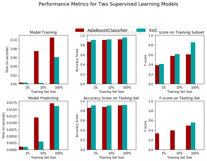
From above Graphs we can clearly see that Support Vector Machine has higher accuracy in comparison to AdaBoost hence we will be using SVM for our further analysis.
Fine Tuning Model
We will now tune our model by finding the best values for its Hyper-Parameters, for doing that we will be using Grid Search from Sklearn library of python.
# Import 'GridSearchCV', 'make_scorer'
from sklearn.model_selection import GridSearchCV
from sklearn.metrics import make_scorer

# Suppressing warnings
import warnings
warnings.filterwarnings('ignore')

# TODO: Initialize the classifier
clf = SVC(random_state=35)

# Create the parameters list you wish to tune, using a dictionary if needed.
parameters = {
    'kernel':['rbf'],
    'gamma' :[0.5,0.8,0.9,1,1.1,1.2,1.3, 10, 100, 200]
}

# Make an fbeta_score scoring object using make_scorer()
scorer = make_scorer(fbeta_score,beta=0.5)

# Perform grid search on the classifier using 'scorer' as the scoring method using GridSearchCV()
grid_obj = GridSearchCV(clf,param_grid=parameters,scoring=scorer)

# Fit the grid search object to the training data and find the optimal parameters using fit()
grid_fit = grid_obj.fit(X_train,y_train)

# Get the estimator
best_clf = grid_fit.best_estimator_

# Make predictions using the unoptimized and model
predictions = (clf.fit(X_train, y_train)).predict(X_test)
best_predictions = best_clf.predict(X_test)

# Report the before-and-afterscores
print("Unoptimized model\n------")
print("Accuracy score on testing data: {:.4f}".format(accuracy_score(y_test, predictions)))
print("F-score on testing data: {:.4f}".format(fbeta_score(y_test, predictions, beta = 0.5)))
print("\nOptimized Model\n------")
print("Final accuracy score on the testing data: {:.4f}".format(accuracy_score(y_test, best_predictions)))
print("Final F-score on the testing data: {:.4f}".format(fbeta_score(y_test, best_predictions, beta = 0.5)))
#Parameter value

print("gamma = {}".format(best_clf.get_params()['gamma']))
Conclusion
By using above model after tuning we are getting 93.13% accuracy, that is, if any data of some other Wine is being provided to us we will be able to predict whether it is Good or Bad by 93.13% Accuracy, which is a pretty good number.
For more interesting articles checkout our website ML for Analytics. And for video tutorials, check our YouTube channel ML for Analytics