

Candlestick charts in Python
Hi All!
In this tutorial, we will be learning how to create candlestick charts in Python along with volume bars and moving average lines.
- The library we will be using to create these charts in this tutorial is mplfinance.
- We will be fetching stock data using yfinance library.
- The stock we will be plotting on is MSFT (Microsoft Corporation).
This is the part 14 of the Financial Analytics series taught by us. Here’s the link to part 13. If you’re new to this series, please go to part 1 here to get good grasp on the core concepts of financial analytics.
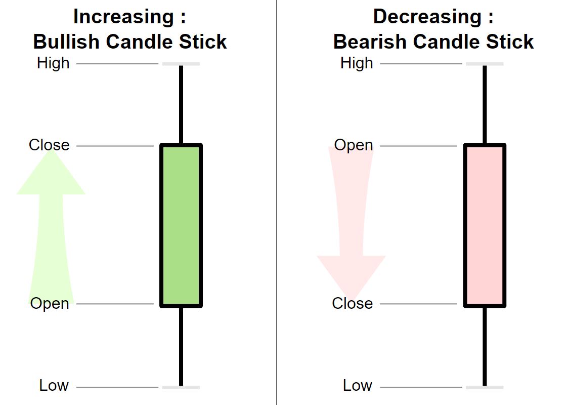
Candlestick charts in Python – Theory
Before proceeding to code, let’s first understand what, why, how and when of candlestick charts.
- The origin of candlestick charts dates back to over 100 years.
- It was discovered by Homma, a Japanese man that trading is not only linked to prices, supply and demand chains, it was also linked to emotions and sentiments of the traders.
- Candle stick charts help in identifying the emotions of traders based on past patters.
- A trading day usually consists of 4 price components – Open (O), High (H), Low (L) and Close (C) – (OHLC). All these 4 components can be shown by a candlestick chart.
- A single candlestick in a candlestick chart typically correspond to one trading day, though this time-period can be reduced or made higher depending upon requirements.
- If, in a trading day, the Close price of a stock is higher than the Open price, that stock is said to be bullish for that day.
- If, in a trading day, the Close price of a stock is less than the Open price, that stock is said to be bearish for that day.
Candlestick charts in Python – Code
Let’s start by importing and loading the libraries. We will be importing 4 libraries:
- Pandas for dataframe manipulation
- yfinance for downloading finance data
- mplfinance for plotting of candlestick charts – mplfinance is matplotlib utilities for visualization and visual analysis of financial data
import pandas as pd
import yfinance as yf
import mplfinance as mf
The next step is to download the financial data-set from yahoo finance using download function of yfinance library.
- The date range we are selecting varies from 1st May 2020 till today.
- For that, let’s fetch today’s date using pandas first and store it in a variable.
- Then we will pass this to the end parameter of download function.
today = pd.Timestamp('today')
today
StockData = yf.download( 'MSFT',
                        start = '2020-05-01',
                        end = today,
                        progress = False)
Let’s now see what’s there in the data-set using head function.
StockData.head()
Let’s now check the variable statistics using the describe function.
StockData.describe()
Let’s also see if the data contains any missing values (which is not there, but still checking!).
StockData.isnull().any()
No missing values (as expected)! Let’s now start plotting the candlestick chart. We will use plot function of mplfinance to achieve that. In the type parameter, we will pass candle to acheive this.
Creating candlestick chart
mf.plot(StockData,
        type = 'candle',
        title = 'MSFT May 2020 walkthorugh',
        ylabel = 'MSFT Prices',
       figratio=(12,8))

Here, we can see that the bearish candlesticks are represented using black color and bullish ones are in white color.
Exploring styles of candlestick plots
Now, let’s see what are the available styles for mplfinance based plots by applying available_styles() function on mf alias.
mf.available_styles()
Let’s apply all these styles and choose the best style for our plot.
# Applying binance style
mf.plot(StockData,
        type = 'candle',
        style =  'binance',
        title = 'MSFT May 2020 walkthorugh',
        ylabel = 'MSFT Prices',
       figratio=(12,8))

Here, in binance style, we can see that the bearish candlesticks are represented using pink color and bullish ones are in green color.
# Applying blueskies style
mf.plot(StockData,
        type = 'candle',
        style =  'blueskies',
        title = 'MSFT May 2020 walkthorugh',
        ylabel = 'MSFT Prices',
       figratio=(12,8))

Here, in blueskies style, we can see that the bearish candlesticks are represented using blue color and bullish ones are in white color.
# Applying brasil style
mf.plot(StockData,
        type = 'candle',
        style =  'brasil',
        title = 'MSFT May 2020 walkthorugh',
        ylabel = 'MSFT Prices',
       figratio=(12,8))

Here, in brasil style, we can see that the bearish candlesticks are represented using blue color and bullish ones are in yellow color.
# Applying charles style
mf.plot(StockData,
        type = 'candle',
        style =  'charles',
        title = 'MSFT May 2020 walkthorugh',
        ylabel = 'MSFT Prices',
       figratio=(12,8))

Here, in charles style, we can see that the bearish candlesticks are represented using maroon color and bullish ones are in green color.
# Applying checkers style
mf.plot(StockData,
        type = 'candle',
        style =  'checkers',
        title = 'MSFT May 2020 walkthorugh',
        ylabel = 'MSFT Prices',
       figratio=(12,8))

Here, in checkers style, we can see that the bearish candlesticks are represented using red color and bullish ones are in black color.
# Applying classic style
mf.plot(StockData,
        type = 'candle',
        style =  'classic',
        title = 'MSFT May 2020 walkthorugh',
        ylabel = 'MSFT Prices',
       figratio=(12,8))

Classic style looks somewhat like default except that default has light blue background while classic has white background. Here, in checkers style, we can see that the bearish candlesticks are represented using black color and bullish ones are in white color.
# Applying mike style
mf.plot(StockData,
        type = 'candle',
        style =  'mike',
        title = 'MSFT May 2020 walkthorugh',
        ylabel = 'MSFT Prices',
       figratio=(12,8))

Here, in mike style, we can see that the bearish candlesticks are represented using blue color and bullish ones are in black color.
# Applying nightclouds style
mf.plot(StockData,
        type = 'candle',
        style =  'nightclouds',
        title = 'MSFT May 2020 walkthorugh',
        ylabel = 'MSFT Prices',
       figratio=(12,8))

Here, in nightclouds style, we can see that the bearish candlesticks are represented using blue color and bullish ones are in white color.
# Applying sas style
mf.plot(StockData,
        type = 'candle',
        style =  'sas',
        title = 'MSFT May 2020 walkthorugh',
        ylabel = 'MSFT Prices',
       figratio=(12,8))

Here, in sas style, we can see that the bearish candlesticks are represented using maroon color and bullish ones are in dark blue color.
# Applying starsandstripes style
mf.plot(StockData,
        type = 'candle',
        style =  'starsandstripes',
        title = 'MSFT May 2020 walkthorugh',
        ylabel = 'MSFT Prices',
       figratio=(12,8))

So, sas and starsandstripes are producing the same result. They’re the same styles with different style names.
# Applying yahoo style
mf.plot(StockData,
        type = 'candle',
        style =  'yahoo',
        title = 'MSFT May 2020 walkthorugh',
        ylabel = 'MSFT Prices',
       figratio=(12,8))

In yahoo style, we can see that the bearish candlesticks are represented using orange color and bullish ones are in green color.
So, which style did you like the most? I loved the charles one. So, I will be using the same in this tutorial.
Adding volume to candlestick chart
In order to add volume variable and candlesticks in one chart, we will have to set the volume parameter of the plot function to True.
mf.plot(StockData,
        type = 'candle',
        style =  'charles',
        title = 'MSFT May 2020 walkthorugh',
        ylabel = 'MSFT Prices',
       figratio=(12,8),
       volume = True )

As you can see, the volume stats have now been added. But this graph is not showing the non-trading days currently. The chart is showing trading days only. Let’s add them in the chart using show_nontrading = True.
mf.plot(StockData,
        type = 'candle',
        style =  'charles',
        title = 'MSFT May 2020 walkthorugh',
        ylabel = 'MSFT Prices',
        figratio=(12,8),
       volume = True,
       show_nontrading = True)

We can also name the ylabel of volumes subchart by setting ylabel_lower to anything we want the label to be.
mf.plot(StockData,
        type = 'candle',
        style =  'charles',
        title = 'MSFT May 2020 walkthorugh',
        ylabel = 'MSFT Prices',
        figratio=(12,8),
       volume = True,
       show_nontrading = True,
       ylabel_lower='Volume of \n traded shares')

Adding moving averages to candlestick chart
Let’s now add moving average lines to this plot. This can be achieved by setting mav parameter to a number. This number defines the window of the moving average. Since, I have daily trading data, setting mav = 2 will set the window to two days.
mf.plot(StockData,
        type = 'candle',
        style =  'charles',
        title = 'MSFT May 2020 walkthorugh',
        ylabel = 'MSFT Prices',
        figratio=(12,8),
       volume = True,
       show_nontrading = True,
       ylabel_lower='Volume of \n traded shares',
       mav = 2)

I can set multiple windows for these moving averages and add multiple lines corresponding to these windows in my plot by passing tuple of these window numbers to mav.
mf.plot(StockData,
        type = 'candle',
        style =  'charles',
        title = 'MSFT May 2020 walkthorugh',
        ylabel = 'MSFT Prices',
        figratio=(12,8),
       volume = True,
       show_nontrading = True,
       ylabel_lower='Volume of \n traded shares',
       mav = (2, 3, 4))

So guys, in this tutorial, we learnt how to make candlestick charts using mplfinance library of Python. We also learnt how to add volume stats and moving average lines in candlestick charts and to get a holistic view of what all is happening in a stock lifetime for the timeline we’ve defined.
Don’t forget to subscribe to our channel, ML for Analytics, where we teach all this by means of videos. Stay tuned!


I just wanna thank you for the content! I will explore in detail thanks for sharing!
Thank you for this tutorial. God Bless you and Family