

Data Visualization Using Matplotlib: Part 1
Hi ML enthusiasts! Today, in this tutorial on Data Visualization using matplotlib, we will learn about visualizing data using the matplotlib library of Python.
Data Visualization is very important in the field of data science. When we are dealing with so much data, it becomes a necessity to visualize that data so that we can interpret and analyze the data effectively. Visualizing data in the form of graphs, tables makes us interpret more information in an easier and better way.
In this series of data visualization, we will learn about all the libraries of data visualization in Python like matplotlib, seaborn, bokeh, plotly and pygal. Let’s get started with this series by taking matplotlib as our first choice.
Step 1: Importing the required libraries
In this tutorial, we will be needing pandas, numpy, decimal and matplotlib libraries. We do this by the following code:
[sourcecode language=”python” wraplines=”false” collapse=”false”]
from matplotlib import pyplot as plt
import numpy as np
import pandas as pd
from decimal import Decimal
[/sourcecode]
As you can see above, I have imported the pyplot module of the matplotlib library and have used ‘plt’ as an alias so that whenever we will be using any function related to that module, we will only have to use plt.
Step 2: Obtaining the data
In order to make learning easy, I have made my own data the code of which is given below:
[sourcecode language=”python” wraplines=”false” collapse=”false”]
years_of_experience = list(10*np.random.random(size = 10))
years_of_experience = [Decimal(years) for years in years_of_experience]
years_of_experience = [float(round(years, 1)) for years in years_of_experience]
#sorting data
years_of_experience.sort();
print(years_of_experience)
salary_per_month = list(100000*np.random.random(size = len(years_of_experience)))
salary_per_month = [Decimal(salary) for salary in salary_per_month]
salary_per_month = [float(round(salary, 1)) for salary in salary_per_month]
#sorting data
salary_per_month.sort()
print(salary_per_month)
eid = [“e” + str(x) for x in list(range(0,10))]
print(eid)
scaled_salary_per_month = [salary/10000 for salary in salary_per_month]
scaled_salary_per_month = [Decimal(salary) for salary in scaled_salary_per_month]
scaled_salary_per_month = [float(round(salary, 2)) for salary in scaled_salary_per_month]
print(scaled_salary_per_month)
[/sourcecode]
- The journey of obtaining our self-made data starts from generating random years of experience by using random module of the numpy library and using random function.
- Note that we have set the size = 10 to get years of experience for 10 employees. random function generates values between 0 to 1. So, we have multiplied it by 10 and then converted it into a list by using list() function.
- The list has values have 8 places after decimal. We don’t want that! We want only 1 place after decimal. So, I have to round it off using round(list, decimal_places) function.
- For this the list having values of type narray has been converted into a list having values of type Decimal using Decimal function. Then , we have used round function to round off the values to 1 decimal place.
- After doing this, we sort the list by using sort() function.
- To obtain employee id or eid, we have used list comprehension by converting the output of range function into a list.
- Note that the salary_per_month has values which are very large in comparison to years_of_experience. This may produce problems in plotting them. So, we do feature scaling by dividing the salary_per_month by 10,000 and storing the output in scaled_salary_per_month.
The outputs generated after doing all this is as follows:
[sourcecode language=”python” wraplines=”false” collapse=”false”]
years_of_experience: [0.6, 1.8, 3.3, 4.1, 4.2, 5.2, 6.1, 6.2, 6.9, 9.5]
salary_per_month: [25179.8, 28016.6, 52511.8, 53136.8, 60543.3, 66009.6, 72682.7, 88142.4, 89690.0, 98114.4]
eid: [‘e0’, ‘e1’, ‘e2’, ‘e3’, ‘e4’, ‘e5’, ‘e6’, ‘e7’, ‘e8’, ‘e9’]
scaled_salary_per_month: [2.52, 2.8, 5.25, 5.31, 6.05, 6.6, 7.27, 8.81, 8.97, 9.81]
[/sourcecode]
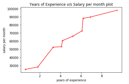
Step 3: Plotting the line chart
Line chart is used to plot numeric variable on x-axis as well as y-axis. Here, we have years_of_experience as our independent numeric variable and salary_per_month as our dependent numeric variable. The dependency between them can be seen from the line chart. The code for obtaining it is as follows:
[sourcecode language=”python” wraplines=”false” collapse=”false”]
#Creating a line chart with years_of_experience on x-axis and salary_per_month on y-axis
plt.plot(years_of_experience, salary_per_month, color=”red”, marker=”+”, linestyle=”solid”)
plt.title(“Years of Experience v/s Salary per month plot”) #Title of the plot
plt.xlabel(“years of experience”) #Label on x
plt.ylabel(“salary per month”) #Label on y
plt.show()
[/sourcecode]
The graph for above case is given below:
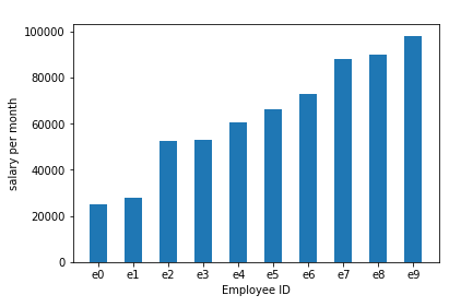
Step 4: Plotting the vertical bar graph
Bar graph is used to plot categorical variable on x-axis and numeric variable on y-axis. Here, we have employee id or eid as categorical variable and salary_per_month on y-axis as numeric variable.
The code for this is given below:
[sourcecode language=”python” wraplines=”false” collapse=”false”]
“””Creating a bar chart with employee id as categorical variable on x-axis
and salary_per_month on y-axis as numeric variable”””
plt.bar(eid, salary_per_month, 0.5) #bar(x-axis_series, y-axis_series, bar_width)
plt.xlabel(“Employee ID”) #Label on x
plt.ylabel(“salary per month”) #Label on y
plt.show()
[/sourcecode]
The vertical bar graph generated is given below:
So guys, with this we conclude this tutorial. To learn about more plots in matplotlib, stay tuned! We will talk about it in the next tutorial.
For more updates and news related to this blog as well as to data science, machine learning and data visualization, please follow our facebook page by clicking this link.


One thought on “Data Visualization Using Matplotlib”