
Data Visualization using Matplotlib: Part 2
Hi everyone, in our last tutorial DATA VISUALIZATION USING MATPLOTLIB: PART 1 we studied about how we can generate our own data and some data visualization methods like bar graph and a single line chart, you can look for them here. In this tutorial we learn some more techniques for data visualization. Please go through from previous tutorial as well for better understanding.
Step 1: Importing the required libraries and obtaining data
Procedure for doing so is well explained in our article DATA VISUALIZATION USING MATPLOTLIB: PART 1, so please go through it for better understanding.
Source code for it is as follows:
[sourcecode language=”python” wraplines=”false” collapse=”false”]
from matplotlib import pyplot as plt
import numpy as np
import pandas as pd
from decimal import Decimal
years_of_experience = list(10*np.random.random(size = 10))
years_of_experience = [Decimal(years) for years in years_of_experience]
years_of_experience = [float(round(years, 1)) for years in years_of_experience]
#sorting data
years_of_experience.sort();
print(years_of_experience)
salary_per_month = list(100000*np.random.random(size = len(years_of_experience)))
salary_per_month = [Decimal(salary) for salary in salary_per_month]
salary_per_month = [float(round(salary, 1)) for salary in salary_per_month]
#sorting data
salary_per_month.sort()
print(salary_per_month)
eid = [“e” + str(x) for x in list(range(0,10))]
print(eid)
scaled_salary_per_month = [salary/10000 for salary in salary_per_month]
scaled_salary_per_month = [Decimal(salary) for salary in scaled_salary_per_month]
scaled_salary_per_month = [float(round(salary, 2)) for salary in scaled_salary_per_month]
print(scaled_salary_per_month)
[/sourcecode]
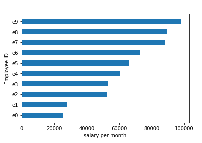
Step 2: Plotting the horizontal bar graph
Horizontal bar graph is used to plot categorical variable on y-axis and numeric variable on x-axis. Here, we have employee id or eid as categorical variable and salary_per_month on x-axis as numeric variable.
The code for this is given below:
[sourcecode language=”python” wraplines=”false” collapse=”false”]
“””instead of BAR use BARH for plotting horizontal bar graph
Plotting y-axis based bar graph”””
plt.barh(eid, salary_per_month, 0.5)
plt.ylabel(“Employee ID”) #Label on y
plt.xlabel(“salary per month”) #Label on x
plt.show()
[/sourcecode]
Output:
Step 3: Plotting the histogram
Histogram is a bar graph which is used to represent the distribution of numerical data specifically for range of data, each bar’s width represents a equal size interval of data. Creating a histogram with marks of students as numeric variable on x-axis and frequency of marks on y-axis as numeric variable.
The code for this is as follows:
[sourcecode language=”python” wraplines=”false” collapse=”false”]
“””Creating a histogram with marks of students as numeric variable on x-axis
and frequency of marks on y-axis as numeric variable”””
marks = pd.DataFrame(np.random.randint(low = 0, high = 100, size=(100, 1)))
marks.columns = [“Marks of students”]
plt.hist(marks[“Marks of students”], color=”blue”, bins=10, histtype=’bar’, ec=’black’ )
plt.title(“Marks distribution of 100 students”)
plt.xlabel(“Marks of students”) #Label on x
plt.ylabel(“Frequency of marks”) #Label on y
plt.show()
[/sourcecode]
Output:

Step 4: Multi-line Line Chart
Line chart is used to plot numeric variable on x-axis as well as y-axis. Here we want to calculate the ‘overall growth of the employee’. To do so we will use two line charts as one, that is we will plot two different data as one. First is ‘years_of_experience’ and second is ‘scaled_salary_per_month’. We scaled ‘salary_per_month’ so that it can be of measurable quantity in comparison to other variable.
The code for obtaining it is as follows:
[sourcecode language=”python” wraplines=”false” collapse=”false”]
“””we can make multiple calls to plt.plot to show multiple series on the same chart
We want to measure Overall growth of employee.
So, we are taking two series, years_of_experience and salary per month
by means of which this can be done”””
plt.plot(years_of_experience, ‘g-‘, label=’Years of Experience’) # green solid line
plt.plot(scaled_salary_per_month, ‘r-.’, label=’Salary per month’) # red dot-dashed line
“””because we’ve assigned labels to each series,we can get a legend for free
loc=9 means ‘top center'”””
plt.legend(loc=9)
plt.xlabel(“Overall growth of Employee”)
plt.title(“Employee Salary and experience distribution”)
plt.show()
[/sourcecode]
Output:

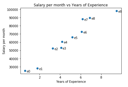
Step 5: Plotting Scatter Graph
Scatter Graph is a type of chart or plot which is used to display the values of two variables on Cartesian Plane using Cartesian Coordinates. Creating a Scatter graph with ‘years_of_experience’ as numeric variable on x-axis and salary_per_month on y-axis as numeric variable.
The code for obtaining it is as follows:
[sourcecode language=”python” wraplines=”false” collapse=”false”]
“””Creating a Scatter graph with ‘years_of_experience’ as numeric variable on x-axis
and salary_per_month on y-axis as numeric variable”””
plt.scatter(years_of_experience, salary_per_month)
# label each point
for empid, year, sal in zip(eid, years_of_experience, salary_per_month):
plt.annotate(empid, xy=(year, sal),
xytext=(5, -5), # but slightly offset
textcoords=’offset points’)
plt.title(“Salary per month vs Years of Experience”)
plt.xlabel(“Years of Experience”)
plt.ylabel(“Salary per month”)
plt.show()
[/sourcecode]
Output:
So guys, this tutorial ends here, giving us opportunity to get into depths of data visualization. In next tutorials we will come come with some more interesting techniques.
So, stay tuned and keep learning!!
For more updates and news related to this blog as well as to data science, machine learning and data visualization, please follow our facebook page by clicking this link.


One thought on “Data Visualization using Matplotlib: Part 2”