
Pygal Tutorial: Part 1
Hi ML Enthusiasts! Today, in this part 1 of Pygal tutorial, we will be working on visualizing data using Pygal plots. From today, I will be introducing new feature to my blog posts, i.e., explaining Python codes and concepts through Jupyter notebooks. They are great for step-by-step analysis of the codes as well as the concepts. So, this is how it goes:
Visualizing data using Pygal
Pygal installation
Installing Pygal requires lxml library as a pre-requisite and then Pygal can be installed using pip. For doing so, run the following commands:
conda install lxml
pip install pygal
Importing Pygal
Next thing to be done is to import the pygal library in our notebook and setting an alias ‘py’ for it. This can be done by the following code:
import pygal as py
Line charts in Pygal
Now, let’s learn how to create a line chart using pygal. For doing so, we use the Line() function of Pygal. We use this by creating an object of pygal.Line() and using that object, we create the title, x-labels, y-labels etc for that chart. The code for creating the line chart is given below:
line = py.Line()
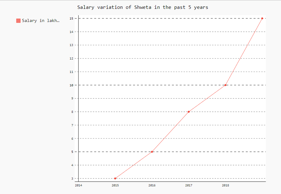
line.title = "Salary variation of Shweta in the past 5 years" #Set the title of the line chart
line.x_labels = (2014, 2015, 2016, 2017, 2018) #Setting the labels for x-axis
line.add('Salary in lakhs in INR', [None, 3, 5, 8, 10, 15]) #Setting the salary values to be plotted on graph
line.render_to_file("salary_variation.svg") #This saves the chart in the current library in the file salary_year_variation.svg
stacked_line.render_in_browser()
The chart will get created and will be stored in a file named as “salary_year_variation.svg” in the library your jupyter notebook is saved. You can go and open the file with Google Chrome. Notice that when you hover over the line, the line becomes bold. When you hover over the points, you will be able to see the description of the points getting popped up.
Stacked line charts using Pygal
The code for the same is given below:
import numpy as np    #importing numpy package with alias as 'np'
import pandas as pd    #importing pandas package with alias as 'pd'
We will do the analysis on house area vs price of houses based on their areas. We will be preparing our own datasets in this case. First, by using the random module of numpy, we will generate house_area in square feet with lowest value being 1000 sq. ft. and highest area being 1800 sq.ft.(Suppose a locality has house areas in this range only). This generates an array of arrays. To make the manipulations easier, we will use list() function to convert the array of arrays into list of arrays. The code for this is given below:
Generating house_area array
house_area = list(np.random.randint(low= 1000, high= 1800, size= (10,1)))
house_area
Now, we will convert this list of arrays into list of floats using float() function. Please note that we have used list comprehension in both the steps. The output we get for the same is given below:
house_area = [float(l) for l in house_area]
house_area
Sorted function
Now, we will sort the house_area by using sorted() function.
house_area = sorted(house_area)
house_area
Generating price in lakhs
Now that we have generated house_area, we will generate the random prices for them.
price_in_lakhs = list(np.random.randint(low= 50, high= 100, size= (10,1)))
price_in_lakhs
price_in_lakhs = [float(l) for l in price_in_lakhs]
price_in_lakhs
price_in_lakhs = sorted(price_in_lakhs)
price_in_lakhs
Normalizing the data
Now that we have both of them ready, let’s normalize them in order to make the comparison easy. The formula for normalisation is
x_normalised = (x-min(x))/range(x).
Since the list is sorted, Max(x) can be found by using x-1 and min(x) can be found using x0. Range(x) = max(x) – min(x). The code for this is as follows:
range_house_area = house_area[-1] - house_area[0]
normalized_house_area = [(l - house_area[0])/range_house_area for l in house_area]
normalized_house_area
range_price_in_lakhs = price_in_lakhs[-1] - price_in_lakhs[0]
normalized_price_in_lakhs = [(l - price_in_lakhs[0])/range_price_in_lakhs for l in price_in_lakhs]
normalized_price_in_lakhs
Obtaining the plot
Now that we have both the variables/features ready, let’s make stacked line chart for both of them. The code for this is as follows:
stacked_line = py.Line()
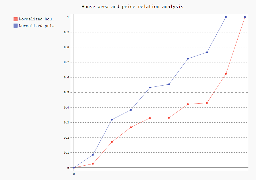
stacked_line.title = "House area and price relation analysis"
stacked_line.x_labels = map(str, range(0, 1)) #Setting the x-axis range from 0 to 1 and converting them into string.
stacked_line.add('Normalized house areas', normalized_house_area)
stacked_line.add('Normalized price in lakhs', normalized_price_in_lakhs)
stacked_line.render_to_file("stacked_line.svg")
stacked_line.render_in_browser()
Run the above code in your own notebook and you will be able to see below charts getting rendered/popped-up in your browser window:
So guys, with this we conclude our tutorial. Stay tuned for part 2 of pygal where we will talk about more interesting visualization techniques! For more updates and news related to this blog as well as to data science, machine learning and data visualization, please follow our facebook page by clicking this link.